Citi’s Ways to Save
Many Citi customers struggled to save—not because they didn’t want to, but because everyday decision fatigue and lack of momentum made it hard to start or stick with it.
Problem
Solution
I led design for Ways to Save, a suite of tools that made saving intuitive for customers and strategically helped Citi increase savings engagement and retention.
Outcome
Over 20,000 customers enrolled in the first 3 months
Contributed to bottom line enterprise deposit goals
$112M in savings driven by customer engagement

Role: As the lead Product Designer for Ways to Save, I spearheaded the creation of personas, user flows, wireframes, testing, and visual design.
Team:
Lead Product Designer
Creative Director
Project Manager
Junior Designer
Platforms: iOS, Android, Responsive web
Disciplines: UX, UI, User Research, Prototyping, Testing
Tools: Figma, Invision
Timeline: 2 months
01 Discovery
What’s the right frame of mind?
Building empathy for the user & identifying behaviors that hinder growth was critical. I aimed to use some common psychological behaviors identified with the UX Researchers that could be applied to Ways to Save. Main takeaways are listed below.
Minimize Decision Fatigue
People can become overwhelmed with too many decisions, especially regarding their finances. Keeping things streamlined and moving is key.
Continual Support
Gentle nudges in the right direction are more welcome than a barrage of information. Even better if it’s contextual and timely.
Reinforce Commitment
Building good habits take time. Small wins add up to a lot of momentum, which leads to growth and lasting change in behavior.
Competitor Analysis
Taking stock of what currently exists in the market helped us see what was working and identify areas that could be improved.
What’s available?
Qapital
Offer automatic deposits within their account settings section of the app
Titan App
Recurring transfers are available within add funds CTA
Point App
Investment features offered within their main account dashboard
Acorns
Houses automated saving rules within a funding section of their app
What’s missing?
Cumbersome integration with bank accounts for real time transactions.
No holistic financial education. Many apps require some financial knowledge to engage.
Multiple options for savings. Platforms typically offer one main way to save.
Snapshots of overall financial picture, including savings and current account numbers.

02 Define
How might we aid in healthy habit creation to improve customers’ savings intuition & financial wellness?
Audience
The target customer base has recently begun to increase their savings, but are not comfortable with investing their hard earned money. We are looking to help the customers learn more about investing and see how their money can grow without any consequences of investing.

03 Develop
Using the problem statement & audience as a guide the three offering of Ways to Save were defined:
• Spend & Save: round-up merchant transaction to the nearest dollar to drive incremental transfers to savings
• Earn & Save: customers can transfer a portion of their direct deposits into their Citi savings account
• Set & Save: recurring transfers to savings drive consistent savings habits
Sitemap
WTS needed to be integrated with our existing Citi dashboard. There was also another project coming down the pipeline, Ways to Invest, that would need to flow with Ways to Save. Creating the sitemap was important to note how the two products would interact and be able to plan in advance. On the right you can see the product designed from the entry point on the main dash board, then the WTS dashboard, and finally each feature landing page.


Wireframes + UX Exploration
Wireframes were important to flesh out the onboarding, dashboards, and mock up customer interactions. I also conducted a graph exploration audit.

User Testing
Questions
How does the user perceive the enrollment flow?
What is the most important information a user needs to see on the WTS landing screen? What would you like to accomplish on this screen?
What is the most important information a user needs to see on each individual WTS Landing Screen?
What would you like to accomplish on these screens?
What value does the customer gain from the graph on the WTS landing screen?
Would the customer enroll in multiple Ways to Save?
The stacked graph was preferred to see all enrollments at a glance
Large text
Easy to follow concepts
What worked well?
Too many steps for enrollment
Too many words and not enough visuals
Difficulty finding how to enroll in additional WTS
What didn’t work well?
The word “Roundups” vs “Spend & Save”
Graph colors - a few neutral palettes were tested & no significant preference emerged
Indifferent?
04 Deliver
Final UI
The final onboarding experience is much more simplified and smooth. I designed each screen using Citi’s Design system, which was flexible enough to allow customization, but maintained a cohesive style with the rest of Citi’s product offerings and also sped up the process. The onboarding flow was designed so the user would clearly see what step they’re on & how many are coming. I also worked with a developer to create an upward scroll animation as the customer completes each step.

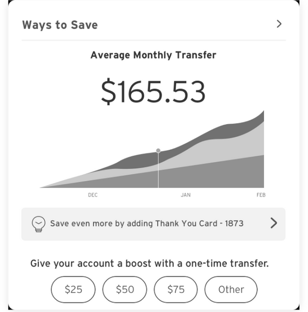
WTS & Individual Dash
The Ways to Save Dashboard is designed to be highly visual, minimizing reliance on copywriting, with a consistent experience across both mobile and desktop. Iterated based on testing findings, this screen helps customers easily locate the Ways to Save features they’re not yet enrolled in. The popular stacked graph, loved by customers during testing, is included alongside recurring deposit information. In line with research findings, educational tiles were also added to help customers improve their financial knowledge. Both the graph and tiles were incorporated into Citi’s design system after this project, ensuring seamless parity across mobile and desktop.
Reflection
After many hours of research, testing, design, and development the final Ways to Save is out to Citi customers worldwide! I’m passionate about design that helps people improve their lives so creating a product that helps people improve financial literacy through recurring savings was an awesome experience. Below are the results once Ways to Save went live.
Impact
Spend & Save
18,277 total enrollments
$369k in completed transfers
Earn & Save
3,530 total enrollments
50+ enrollments / day
$150 avg transfer
Generated over $1MM in transfers to Citi Savings
Set & Save
Generated over
$112,902,873 in 3 months in transfers to Citi Savings
Additional Work

Canvas Design System
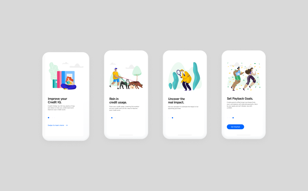
Credit Climber by Citi

Artwork Sales App
DZ Web Design & Design System