David Zwirner Sales App
At high-stakes art fairs, David Zwirner’s sales team struggled to access inventory and share offers quickly, often losing momentum—and potential sales—mid conversation.
Problem
Solution
I spearheaded the design of a fast, cross platform sales tool that let the team instantly find artworks, discreetly manage data, and send tailored offers without breaking the flow.
Outcome
Increased sales conversions via seamless in-app email offers
24% faster task completion by Sales Team
Role: As the lead designer for the Digital Gallery app, it was my responsibility to drive the research, end to end UX/UI design, testing, and dev handoff. Additionally, I managed the design process and reviewed the work of two other designers.
Team: I worked with a design pod comprised of a CD, one additional designer, a Product Owner, and a Project Manager. I also worked closely with a dev team.
Platforms: iOS
Disciplines: UX, UI, User Research, Prototyping, User Testing
Tools: Figma, Origami
Timeline: 10 weeks
Research
Through interviews with 12 salespeople and shadowing them live at fairs, key moments of friction emerged:
Searching for inventory mid conversation broke momentum
The existing appalagged in high traffic settings
Crafting separate emails to send offers slowed things down
Need to discreetly hide data while interacting with customers
Sitemap
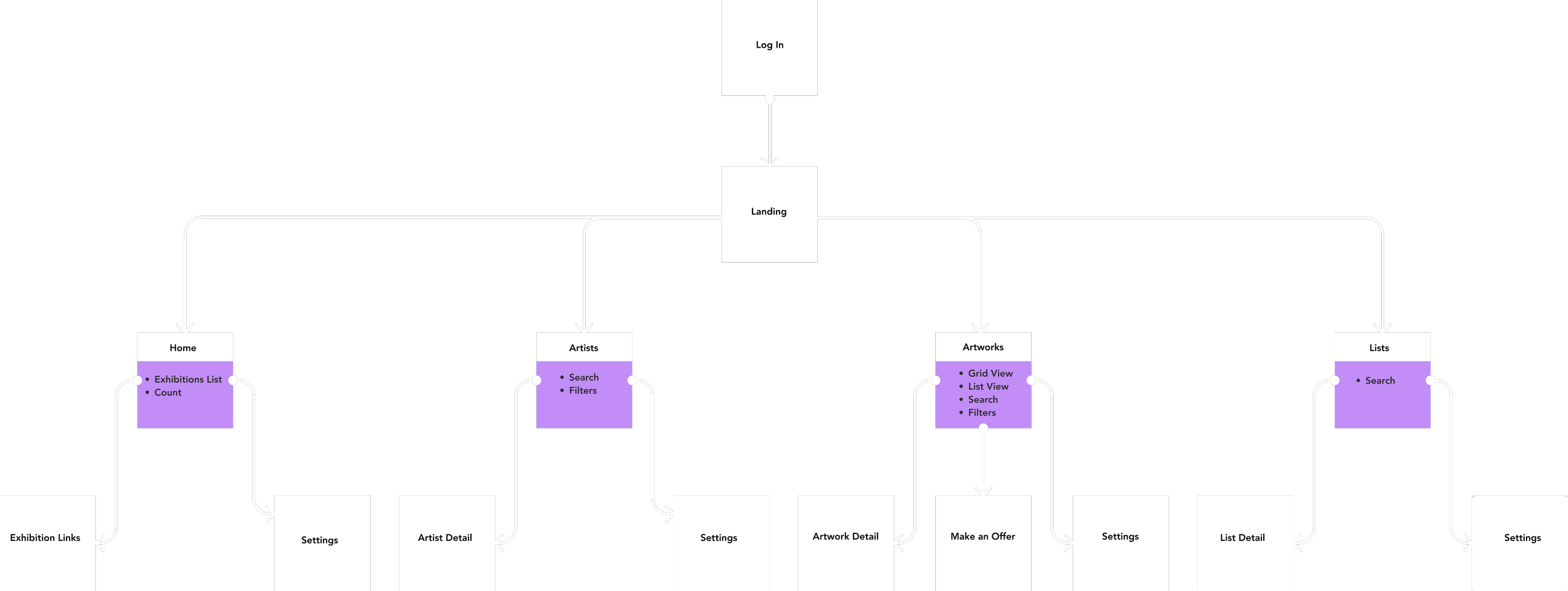
Since the app was being built from 0:1, the initial focus was to get the structure correct
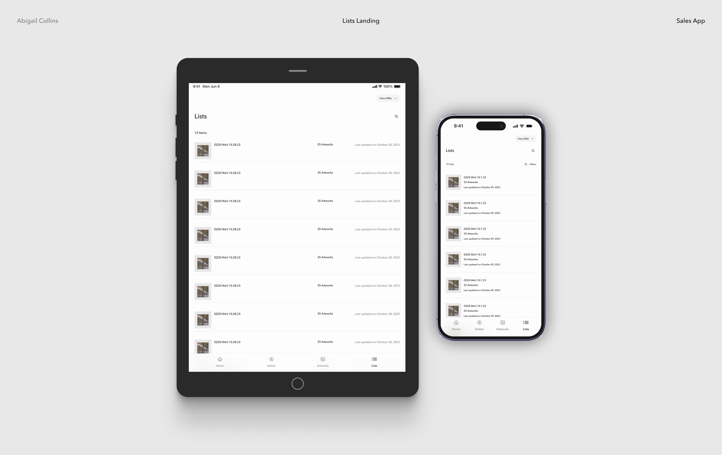
The key pages are outlined in purple which are Home (Exhibitions), Artists, Artworks, and Inventory List
Creating this early was key because sitemaps offer a great way for business and dev stakeholders to understand the scope of a project and translate user needs into a concrete product
Low Fidelity Wireframes

Simple wireframes of the app are a good point to get feedback, so there are no visual distractions and stakeholders could focus on a structure that made sense to them
Below is an early iteration of the Home Page. I tried a tabbed structure for Exhibitions & Lists so the user could easily navigate between this two key sections. However, after speaking with stakeholders, it became clear that they had concerns about opening up sensitive information around clients. They wanted a Home Page that was always client friendly with no private data.
Current Exhibitions of the gallery was relevant and always safe for the salesperson to open the app. Further iterations of the design include this decision.
High Fidelity Wireframes
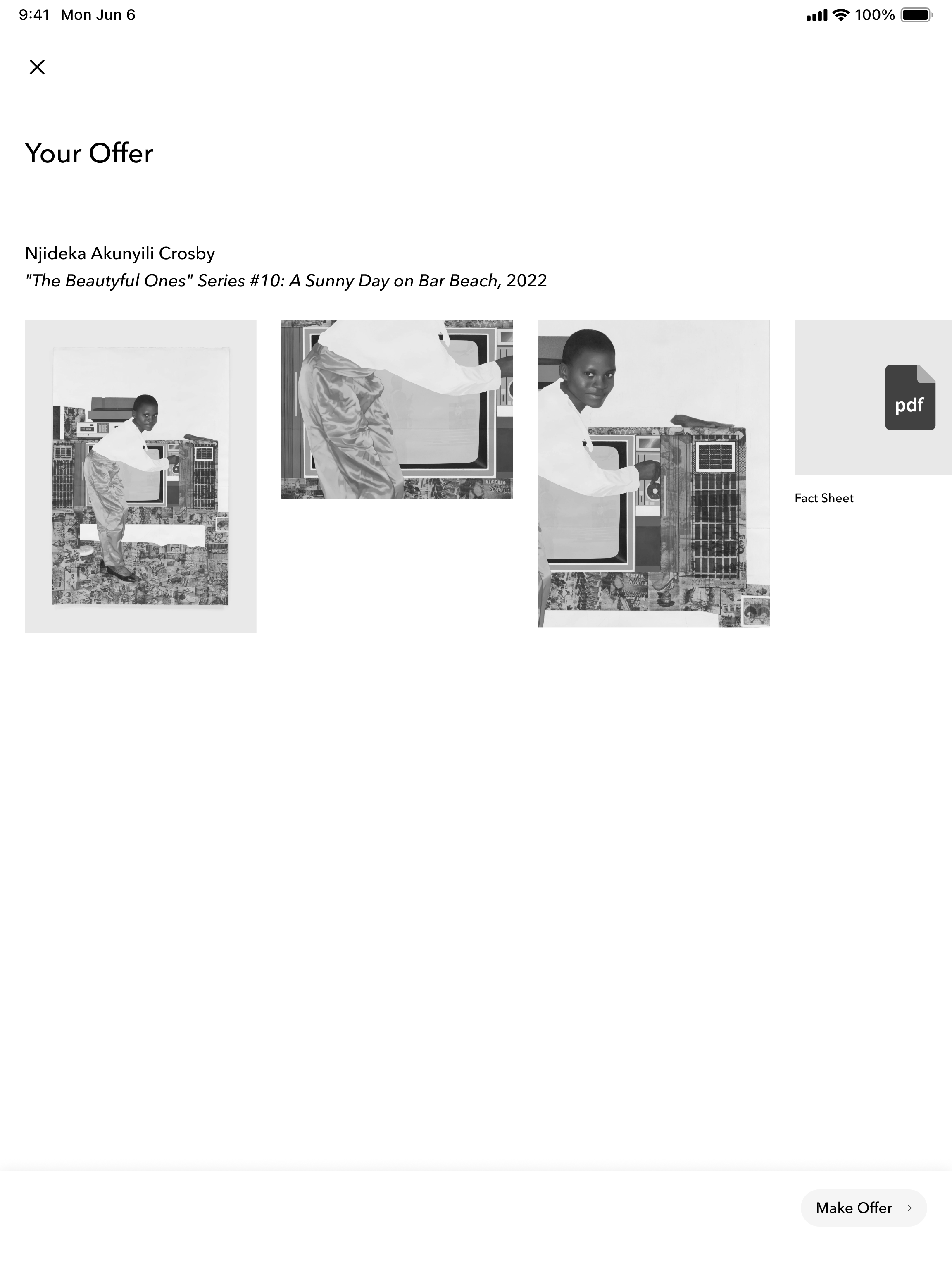
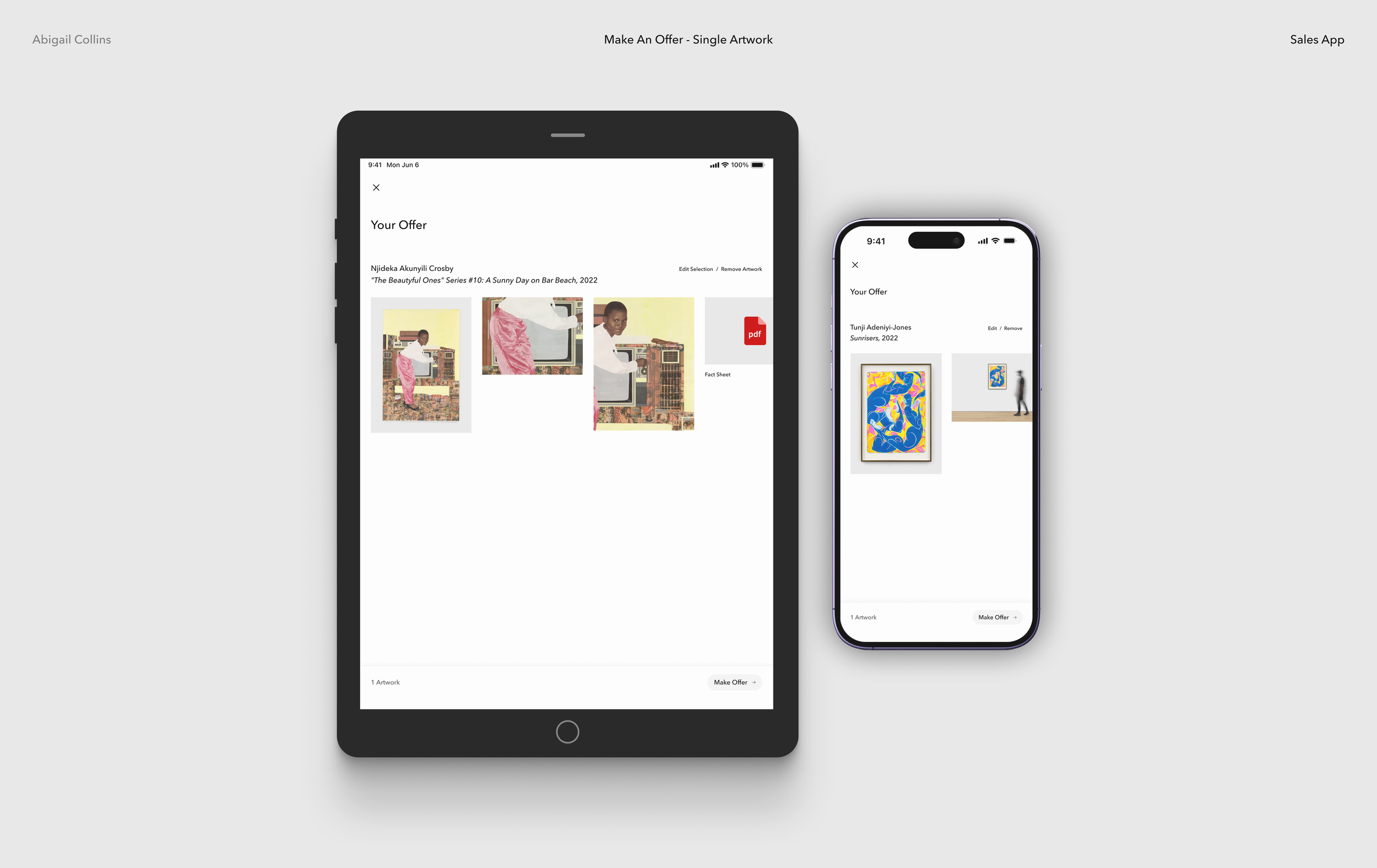
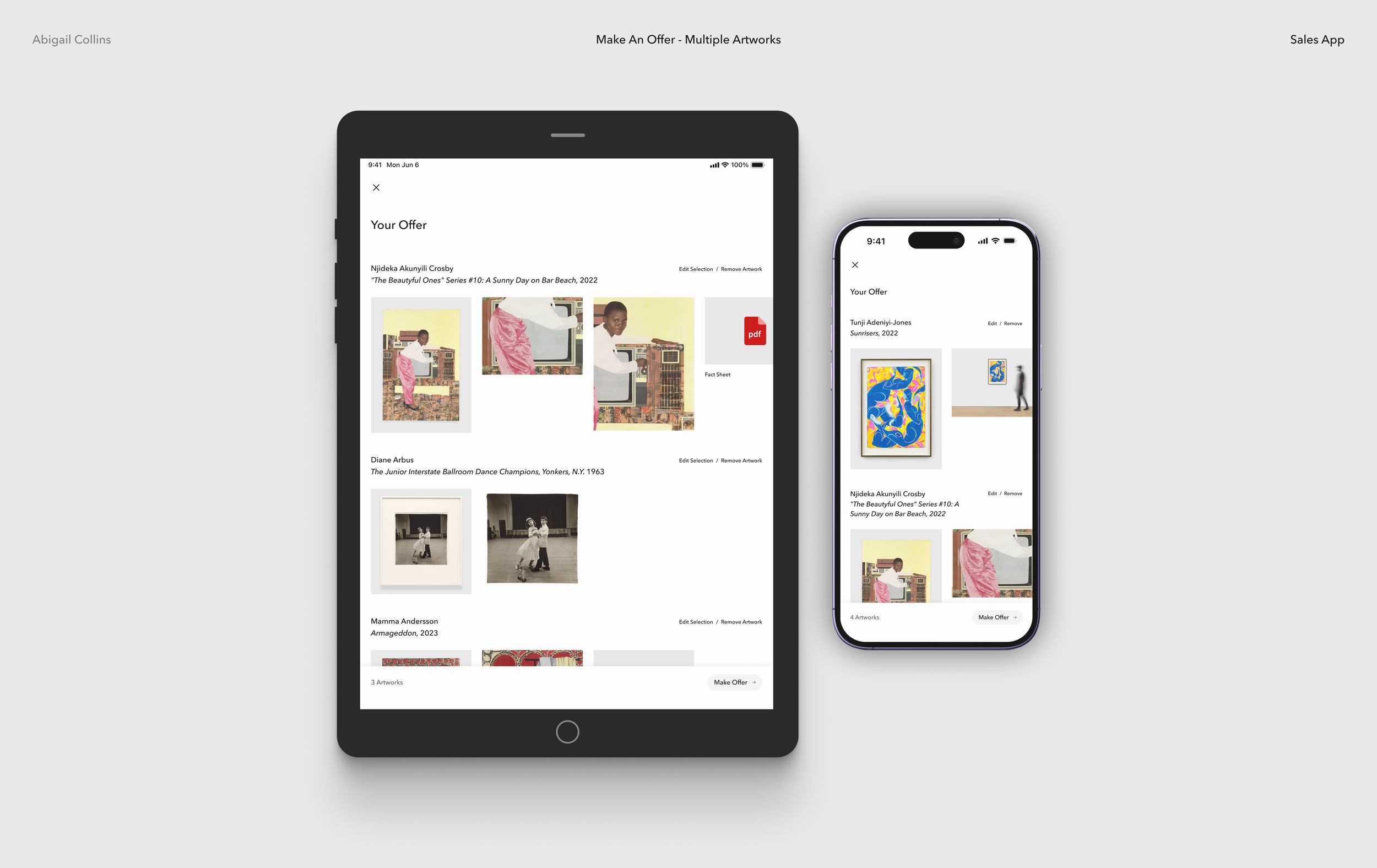
Below is an early version of the Make an Offer flow. The feedback was positive overall, but there was a desire to be able to edit and remove artworks from the offer.
Later iterations include a more dynamic approach to creating offers for the client.
Testing
Usability testing on the wireframes provided key information to guide the final UI. I was able to sit down with 15 salespeople and observe their interactions with the app.
Testing Questions
Are different sections easily searchable? Artwork inventory, Artist Pages, etc?
What information needs to be private vs public?
Is the offer flow easy to use?
Lessons
At a glance Home Page view with current Exhibitions worldwide
Add sorting options for Artwork Inventory
Toggle for private information
Ability to edit and delete artworks from the offer and integrate with email
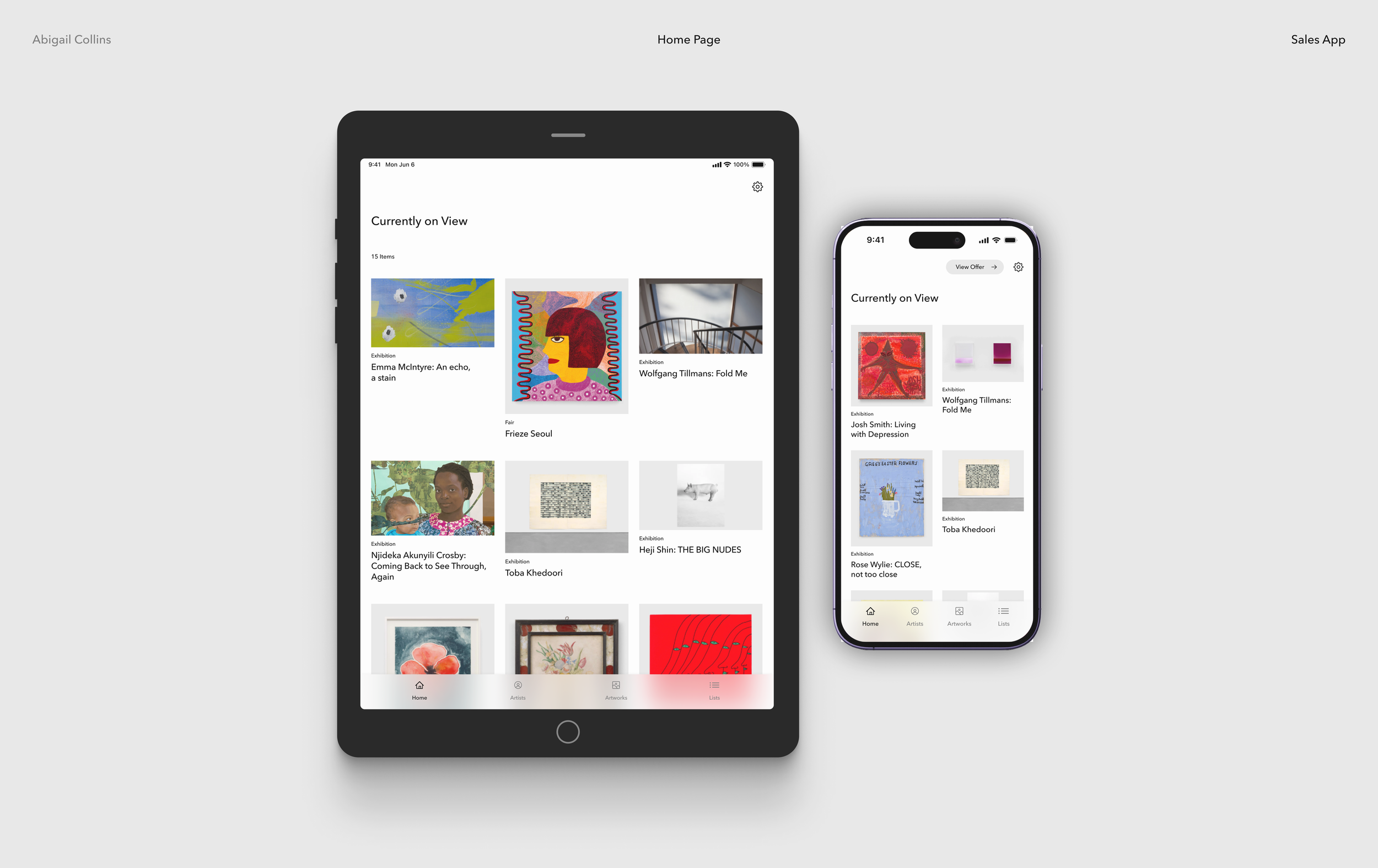
The Home Page contains client friendly Exhibition tiles and easy navigation between tabs. Modular grid components I created for the design system allows cross platform ease.
Client Friendly Home Page

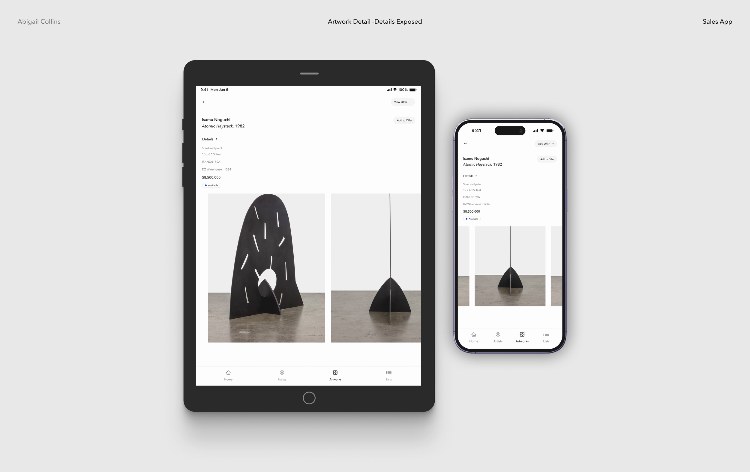
Artwork can be browsed with ease with toggles, filters, and search. Detailed shots of the artwork are available as well as sensitive information behind a tap.
Seamless Search
The gallery Sales Team is able to easily browse exhibitions, find and add artworks to an offer, review and edit, then send an offer. Once ‘send an offer’ is pressed, a pre-populated email will open to send to a client of their choice.
Make an Offer Flow
Artwork Detail Interaction
Using Origami, I mocked up an interaction for the artwork detail viewer. I wanted to highlight that the carousel scroll would pause at each image, giving the viewer the experience of stepping close to an artwork at a gallery. This greatly helped the dev team understand the exact interaction design needed for this key page.
Final Designs


Results
100% team adoption within 3 months, just in time for fair season
24% faster task completion by Sales Team
Increased sales conversions via seamless in-app email offers
Significant cost savings by bringing the tool in-house
Strong partner feedback on usability and workflow improvements
Prototype
Please view the Interactive Figma Prototype for all views
Additional Work
Ways to Save

Canvas Design System
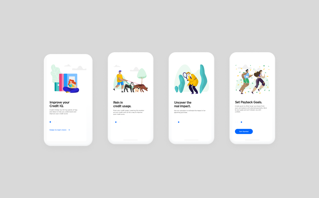
Credit Climber by Citi
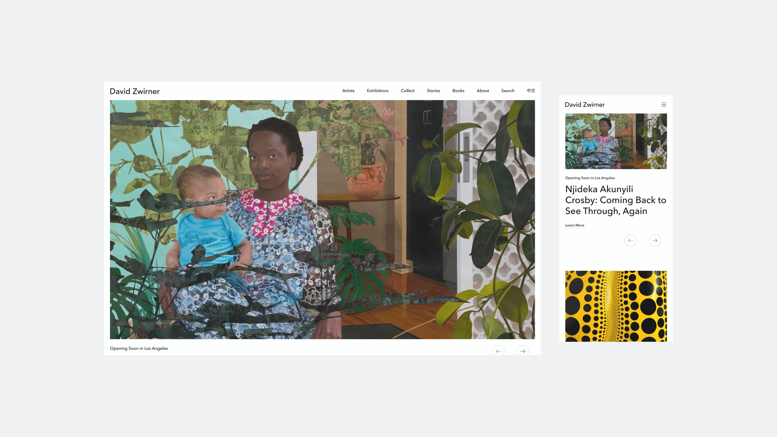
DZ Web Design & Design System