David Zwirner Web Design & Design System
David Zwirner Gallery is a global and refined brand, representing world class artists and programming. However, the digital footprint didn’t represent this. There were numerous brand inconsistencies, UX issues, and accessibility problems.
The ask included crafting a design system and implementing refreshed branding to align with the vision of the company.
Role: As the lead designer for the design system & website redesign, I created atoms, molecules, and components that were validated and tested. I also crafted key pages such as exhibitions, artist profiles, available works, and consignments. The redesign integrated e-commerce to expand revenue opportunities and ensured designs reflected the global DZ brand.
Team: I worked with a design pod comprised of a CD, one additional designer, a Product Owner, and a Project Manager. Additionally I worked a development team.
Platforms: Responsive web
Disciplines: Design Systems, UX, UI, User Research, Prototyping, Testing
Tools: Figma, Origami
Timeline: 3 months
Process
01 Audit
Capturing and documenting screens across app/desktop/mobile. This allows a birds-eye view of broad patterns and any inconsistencies.
02 Concept
A chance to make visual updates on a global scale, the Brand and Product Design teams created visual directions to align on a consistent and unified DZ.
03 Validate
Apply the chosen visual directions to key screens across app/desktop/mobile, which will ensure our visual directions align with any and all content, UX, SEO and performance requirements.
04 Apply
Rollout base Design System across surfaces—taking a progressive enhancement approach whilst we test and learn.
01 Audit
Questions
• Is there a global navigation found on all pages?
• Is the mobile design usable and accessible?
• Is there a clear typography system, with consistent font weights and sizes?
• Are components (buttons, inputs, icons, etc.) consistent with clear states and interactions?
• Are similar sections/modules consistent across pages?
• Is there a consistent grid used?
• Are margins and padding consistent across screen sizes and breakpoints?
Visual Findings
• No clear brand styles
• Inconsistent color palette (currently 15 different grays found across the website)
• Font size and weight varies from page to page
• Buttons & icons have inconsistent sizes, styles
• Margins and padding vary between pages and breakpoints

UX Findings
• Navigation improvements needed. For example, exposing nested content and pages
• Mixing functionality patterns, such as “+” icons used for expansion of content and exposing sub navigation
• Missing clear and labeled states for:
• Inputs in flows, such as persistent Titles which inputs are required
• CTA states including default, hover, focus, error, visited, or active
• Lack of section titles clearly identifying groups or sections of similar or related content
Accessibility Findings
• Ensure all colors have sufficient contrast (4.5:1)
• Clear visual indicators on all links and states across buttons. Such as, all text links have underline and alternate secondary state indicator other than color
• Focus states accessible by keyboard for all interactive components
• Touch zones have ample spacing
• Ensuring code for screen readers by removing text as image/video
• Ensure image/video displays properly across screen sizes


Screen Captures
Examples of the David Zwirner website before the redesign began.


02 Concept
The correct way to rebuild the website was using Atomic Design principles, starting with getting the foundational atoms right. My team worked closely with with developers and product owners to ensure that each step of the process was in alignment.
Atoms
Atoms are the building blocks of any design system. They are a set of guidelines and components that the entire system is based upon.
Grid
The below is mainly to reinforce that all web design is based around a 12col grid. This is predicated within the code, so all designs should adhere to a column based layout to ensure a fluid responsive layout. Visually, this is simplified for smaller screen sizes, as we work with a 2 column grid (6col + 6col) layout.
Looking at the new Design System for David Zwirner, we want reduce breakpoints and promote the adoption of “fluid” responsive design patterns. A single breakpoint should exist at 768px, creating a clear distinction between Tablet/Mobile and Desktop screens. Within each breakpoint, content should resize responsively to ensure the best viewing experience any screen size. This is includes clearly defined image ratios and fit-fill parameters, as well as Responsive Ems (rem) for type sizes.


Mobile Grid
Tablet Grid
Desktop Grid
Typography
The type scale includes a range of contrasting type-sizes that support the needs of our product and content. Aiming to simplify and unify our product surfaces, we have one consistent type scale that is optimized to provide the best legibility across all screen sizes. The type scale follows t-shirt sizing for a clear and applicable naming structure that does not limit or confuse application.
Across breakpoints we generally shift up/down one t-shirt size. So while you should follow each ‘page’ design, a core rule would be text would drop from ‘lg’ to ‘md’ going from desktop to tablet/mobile.
Additionally, we should only need to host 2 weights of Avenir — Medium and Medium Italic under the current Design System. Hierarchy is defined through the Type Scale shown below and the use of Black100 and Black60. Page designs should clarify how this applies and any exceptions for unique needs.

Color Palette
The color palette is very restrained to grayscale to emphasize the artworks and other imagery on the website. The scale is even and we took note to clarify which text colors can be used on each background color.


Atomic Component Examples

Molecules
Molecules are built of a set of atoms and are customizable given context and platform.
Hero Module
The ‘Hero’ molecule presents primary representation of content, generally found at the very top of a page
If only one ‘content’ piece is found, it is a singular view. If multiple, the hero turns to a carousel and the arrows are presented.
Heroes in carousel format, should have auto-scroll behavior as part of the module, set to a timing of 10 seconds


Carousel Module - Desktop & Mobile
The Carousel molecule presents a set of cards in a horizontal scrolling row. Carousels are based on T-shirts sizes which reflect the Card sizes within.

Organisms
Organisms are complex molecules with specific related functionality or layout. This could contain a single molecule or a group of molecules that have unique purposes and/or which should be crafted as a singular entity.
Artwork Grid


Content Grid

03 Validate
Fusing all the pieces from the design system together, our team created designs for each key page of the website. Exhibitions, Available Works, Artwork Detail, and Artist Detail. These designs were brought to stakeholders for approval and also tested with a variety of content to ensure the system could support the variety of editorial the website needed. Below are the results of this effort.
Responsive Web Stills
Please view the Interactive Figma Prototype for scrollable web pages


After working closely with the dev team to create harmony between the designs and the dev output, the rollout of new pages began. We began releases key pages at a time, to follow an agile process instead of causing a shutdown of the website as we replatformed. The results of the new design system are a cohesive and elegant brand, worthy and reflective of the global reach of David Zwirner. It is also responsive, accessible, and able to continue evolving.
04 Apply
Additional Work

Ways to Save

Canvas Design System
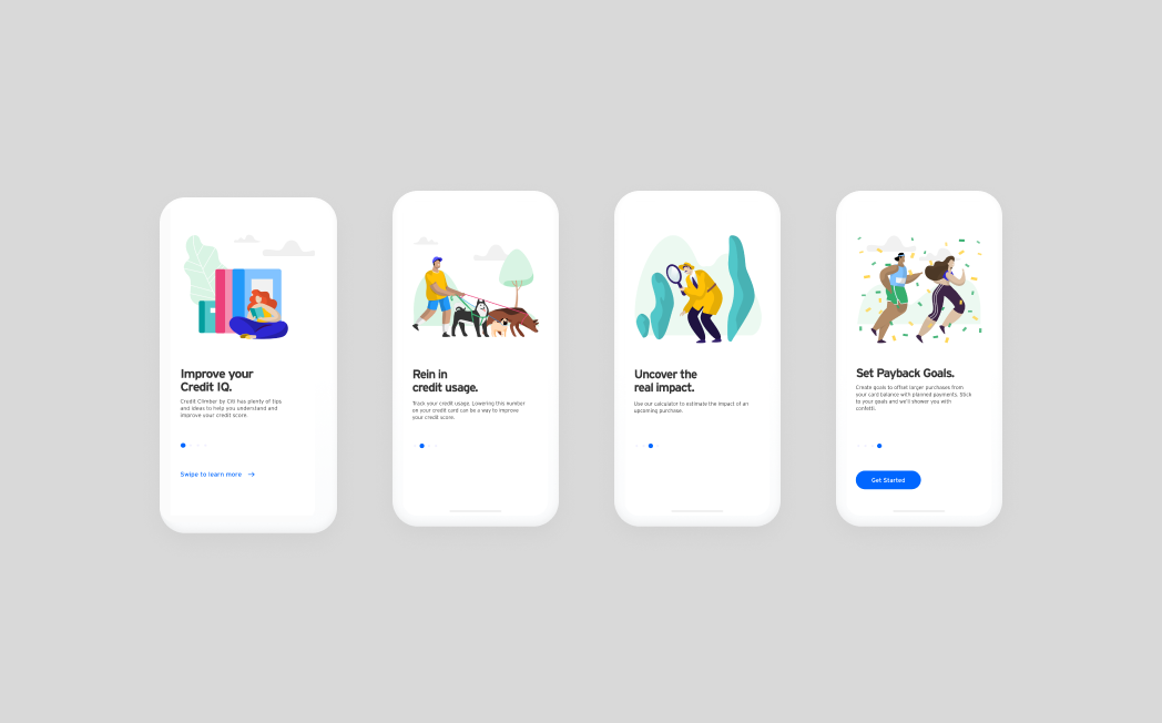
Credit Climber by Citi

Artwork Sales App