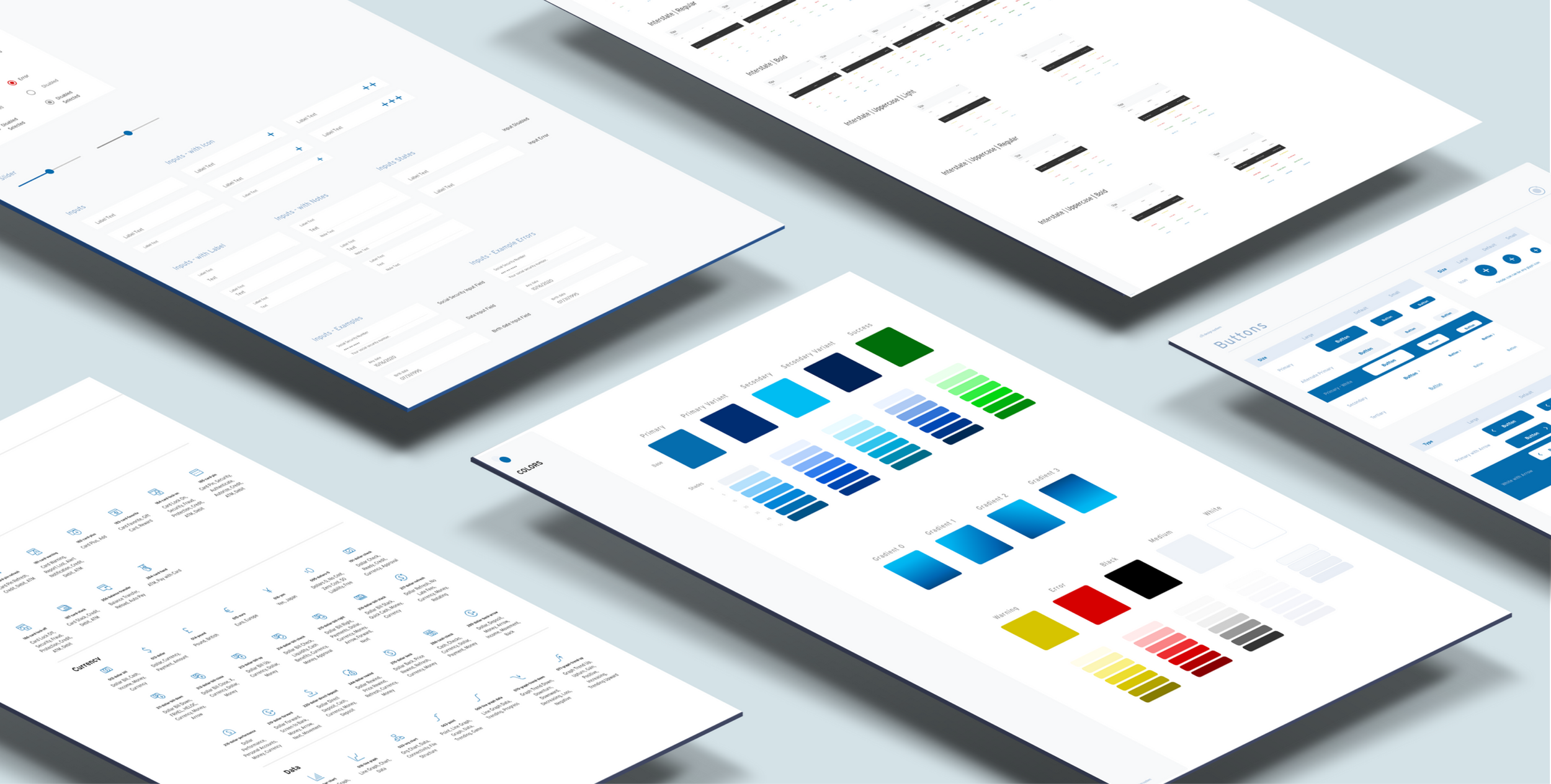
Citi’s Design System
Citi is a 200 year old bank - bringing forward that institution into the modern design world was challenging to say the least. Citi had many different brands and branches worldwide, but no cohesive identity. Each region had its own Design Language custom to their diaspora, however, no one was using them. In fact, I was on a few projects where I would create a design language for the project itself and distribute it around the small team of designers.
Role: My role as a senior product designer was to create user centric components, craft color palettes, test, and build the community to ensure adoption + create excitement across the team.
Team: I worked with a design pod comprised of a CD, ACD, two junior designers, and a Project Manager. I also worked closely with a Product Owner, UX engineers, and a dev team.
While the design pod was my day to day, I collaborated with an additional 20 designers worldwide and eventually the design system supported over 100 designers at Citi.
Tools: Figma
Timeline: 5 months
Goal
Our work was cut out for us and the objectives needed to be clear. Working with teams from Tel Aliv to Mexico City to London to Hong Kong was a start. I worked to pool the work and resources to come up with our north star.
Citi Design system would be
Cloud based
Themable whenever a new product, partnership, or brand is created
Compatible with a dev team from the start
Strategy
Citi’s Design System is its own product and needs to be approached as one. That means constant iteration, user feedback with designers, and testing with data.
Cross functional collaboration was also key. I worked with a team of dedicated UX engineers to create resuable, scalable, and responsive components. It also made it clear why a design system is essential for development teams as well.
This also involves constant communication with stakeholders, making sure any updates reflect the brand’s evolving direction without losing sight of its core principles.
Foundation
Spacing
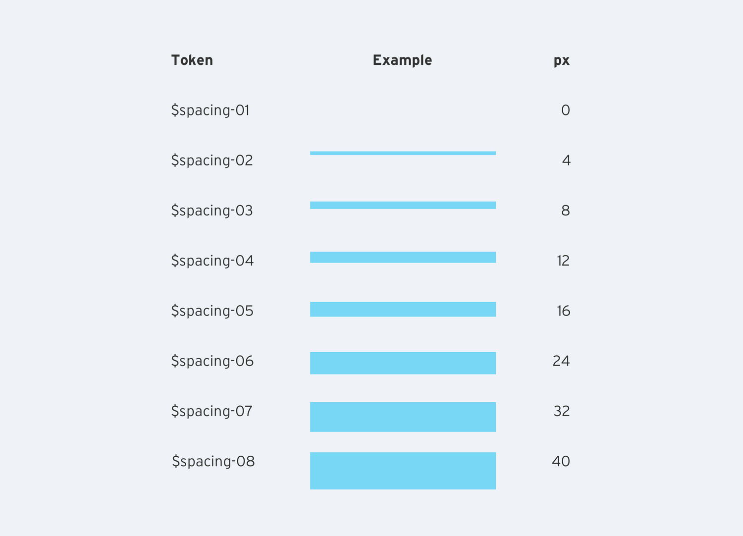
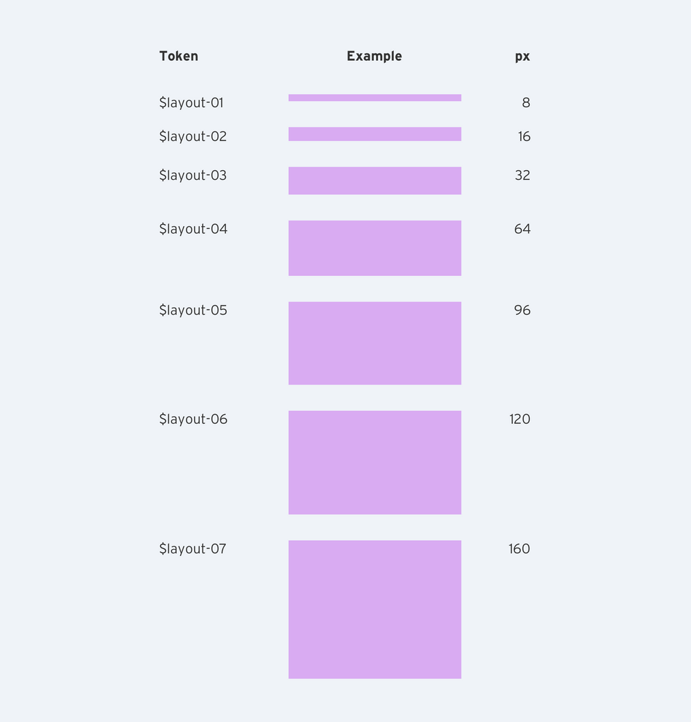
CDS uses two types of spacing to help designers set a foundation for margins and padding. The spacing scale on the left is for individual components or small increments. The layout scale on the right is for arranging components into a full page layout and large increments. The tokens are for developers to use in the coding process.
Typography
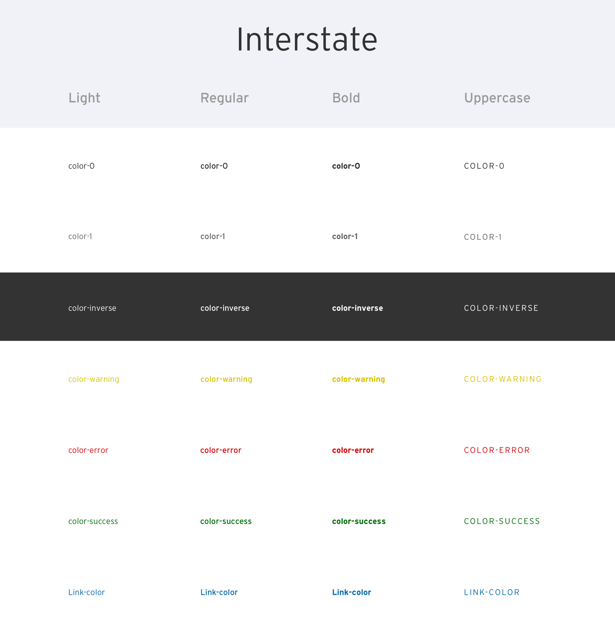
Interstate was chosen for CDS because of it’s very accessible and is versatile enough to be used across a variety of font weights, colors, and sitations.
Iconography
The icons were designed to be clean, light, and informative. Since many of the icons depict finances in some form, they had to be very universally understandable. The icons were tested across a variety of device sizes to ensure accessibility standards were met.
Themes
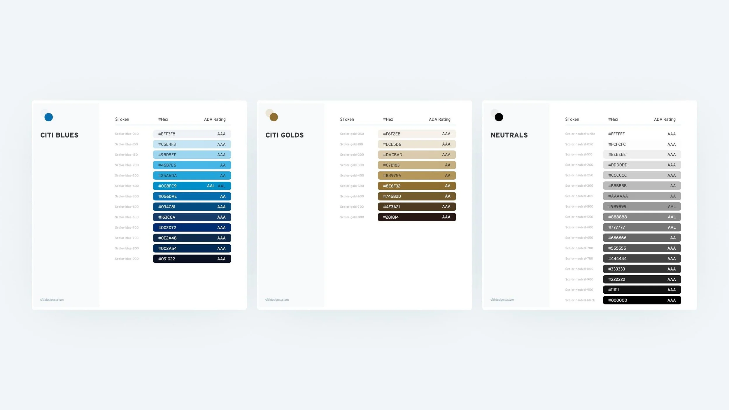
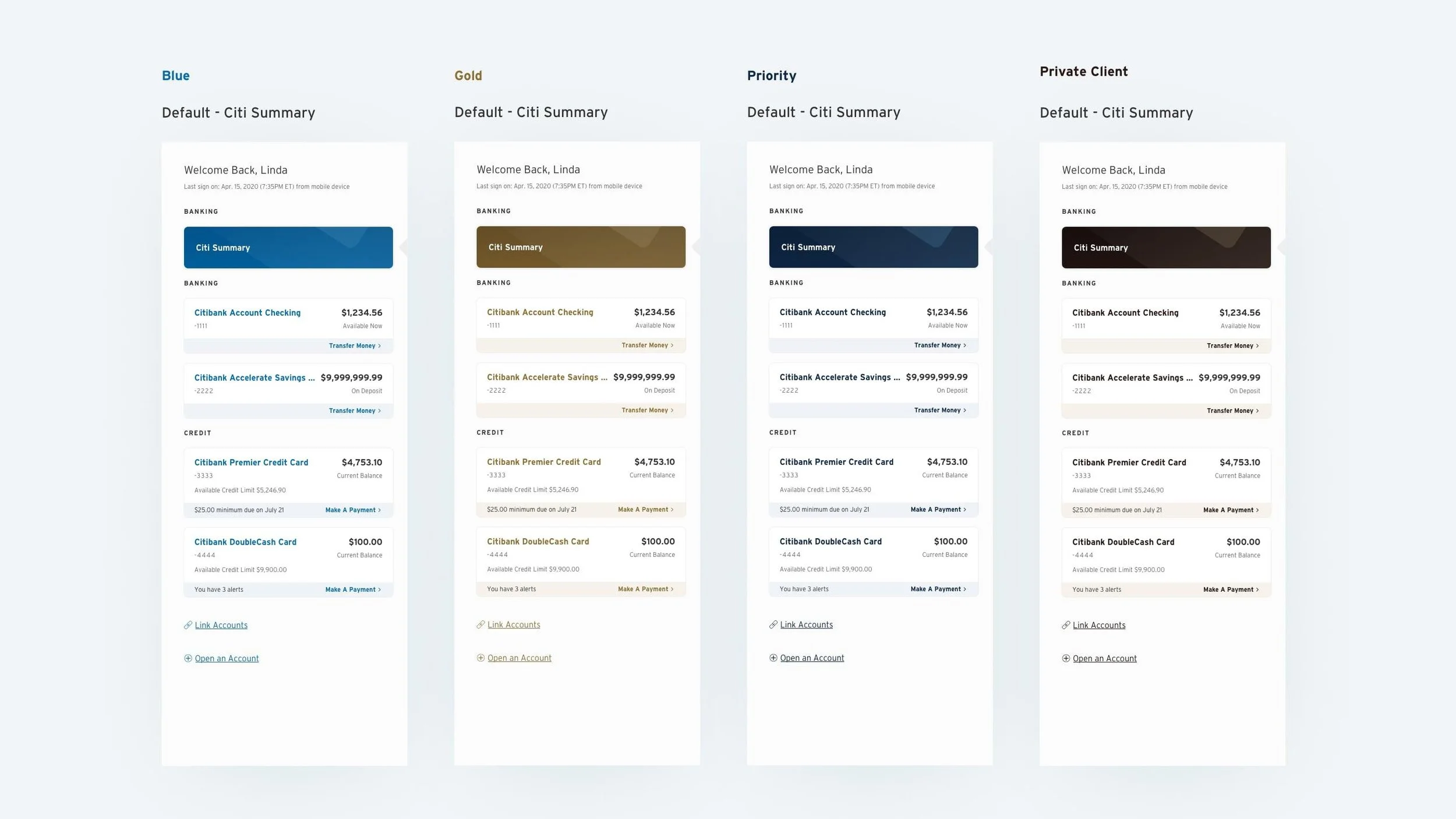
The following themes are based on our customer segments and product offerings. Each designer’s responsibility is to properly use CDS color theming and attach any colors used to the correct variable and mode. So, as a customer transitions from one segment to another their theming experience is seamless. This also ensures our experiences remain accessible and compliant.
Component Creation
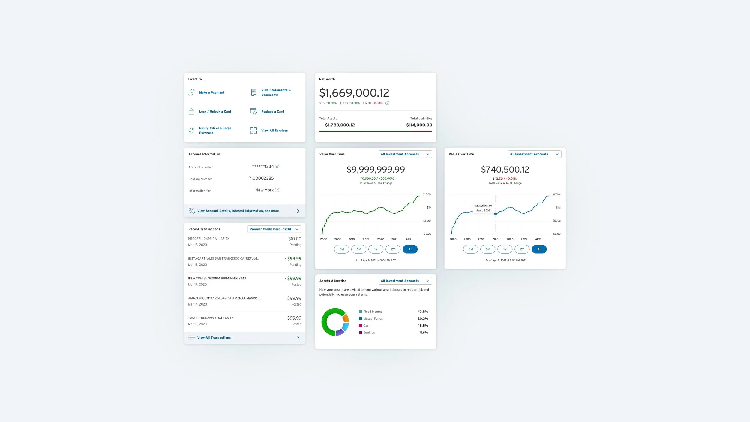
For component creation, I’m going to take you through an example of how the pie chart was created.
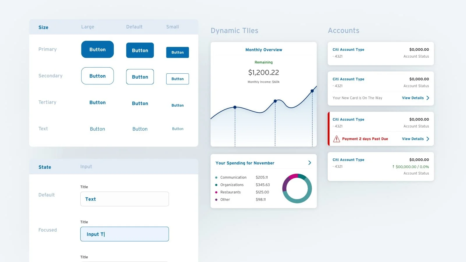
It was important to gather information to make sure the component works for every use case. I interviewed teams across the org to see what types of charts were in use and also looked at industry examples. Then, I designed a chart that would fit all of those needs.
After, I designed the pie chart you see on the right. It’s clean, easily customizable, and is interactive. I worked with a prototyper to develop that interaction on ProtoPie and then with developer to code it for web + mobile.
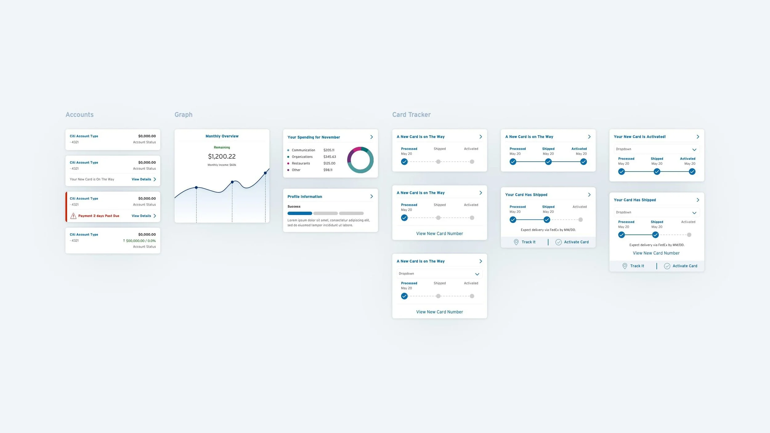
Additional Examples
Component Documentation
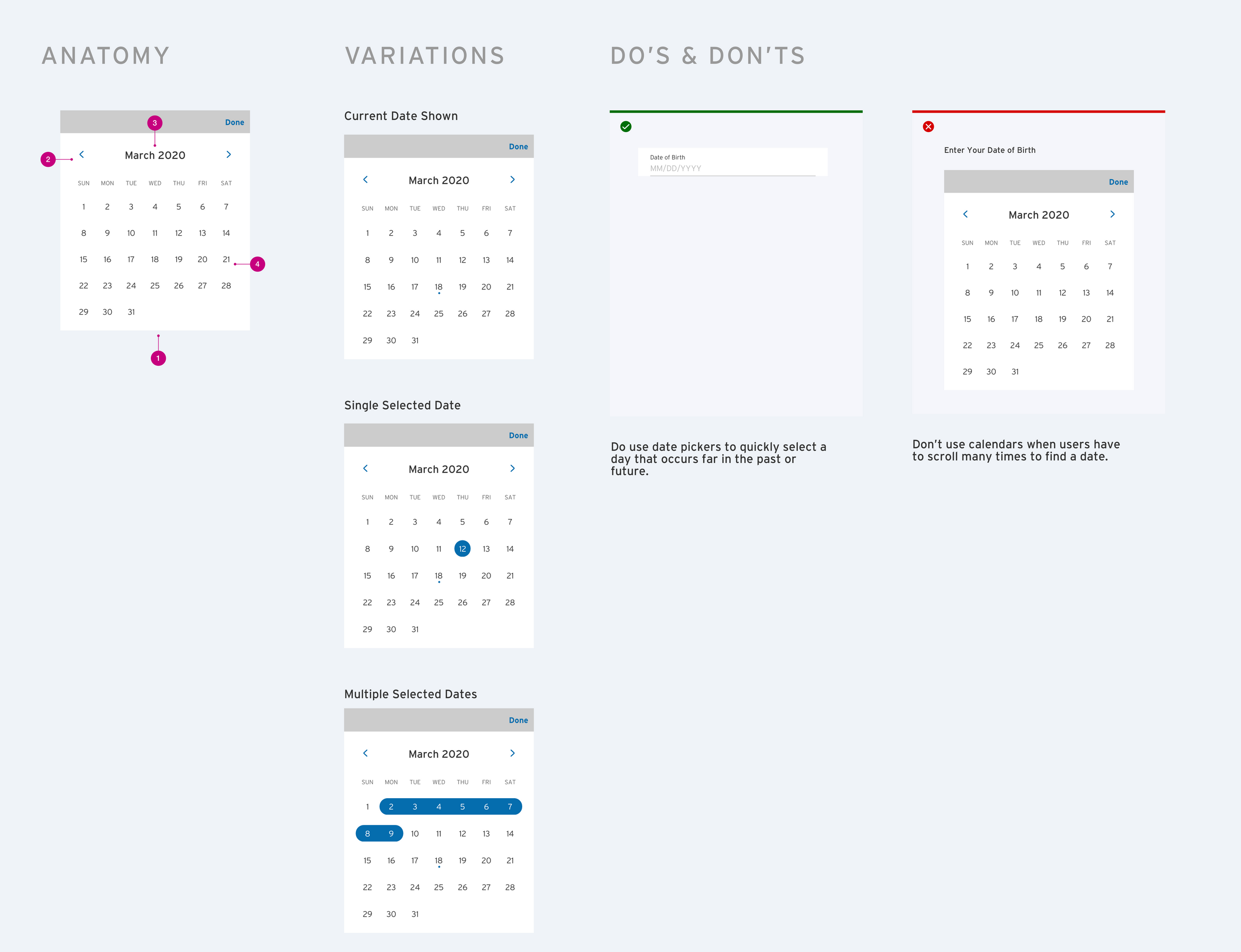
Using Invision to house our documentation, I took the lead on annotating each component with it’s anatomy, variations, and use cases. I collaborated with a technical copywriter and received iterative feedback from other design teams. The documentation, along with the design system, is ever evolving.
Below is an example of the calendar component - along with all of it’s documentation.
Community
CDS would not be where it is without the community of designers, developers, copywriters, and producers. Collaboration and cohesion are critical to a design system’s success, especially when it comes to a company as large as Citi.
The design system community thrives via weekly open house meeting across the design team, playbooks for specific features of the design system, and a community library. The weekly open house is one hour per week hosted by the design system team. Meetings will consist of details following a release, a forum where teams can bring CDS questions or ideas, and a way to view how teams are using the system across the design org.
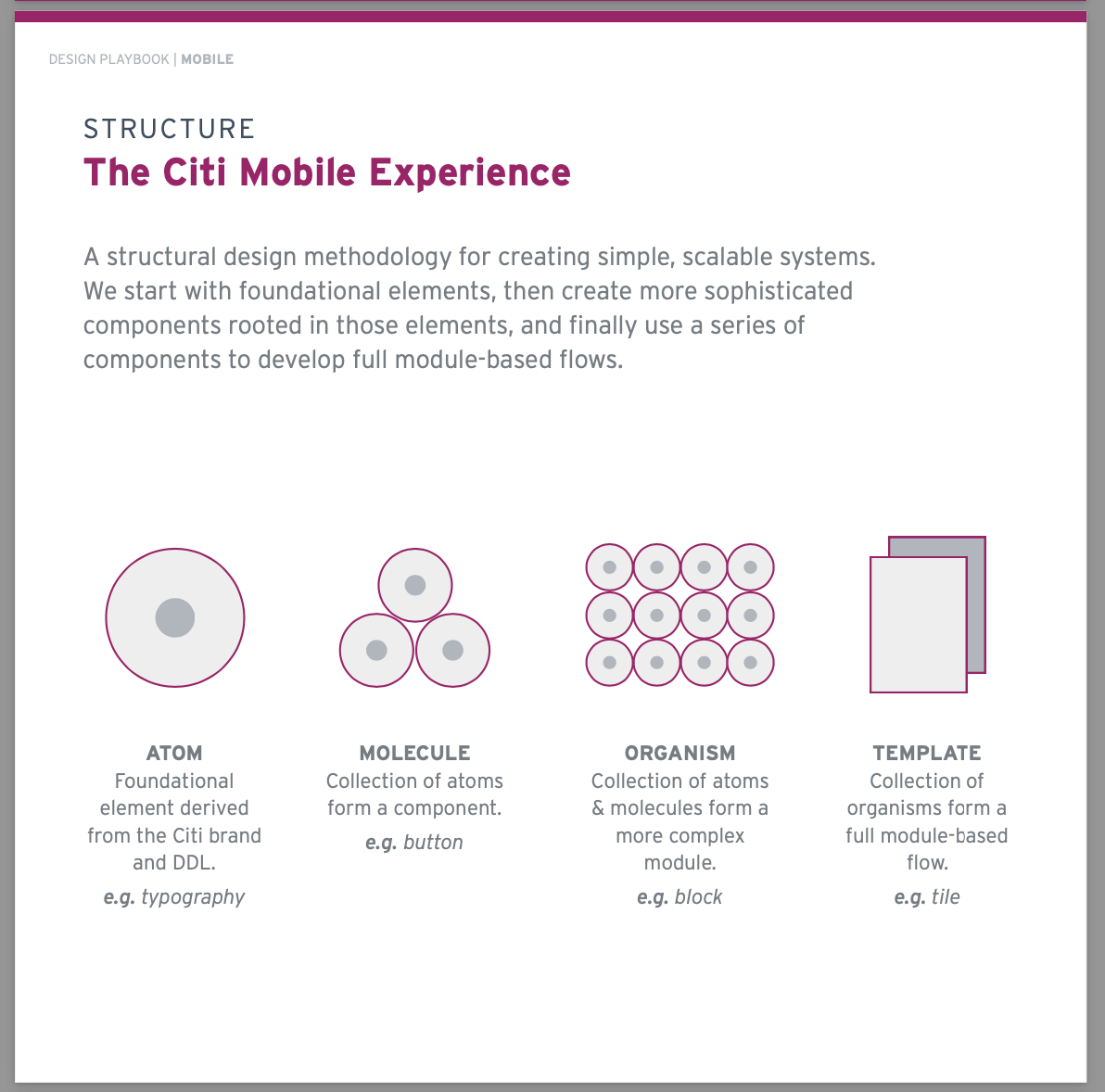
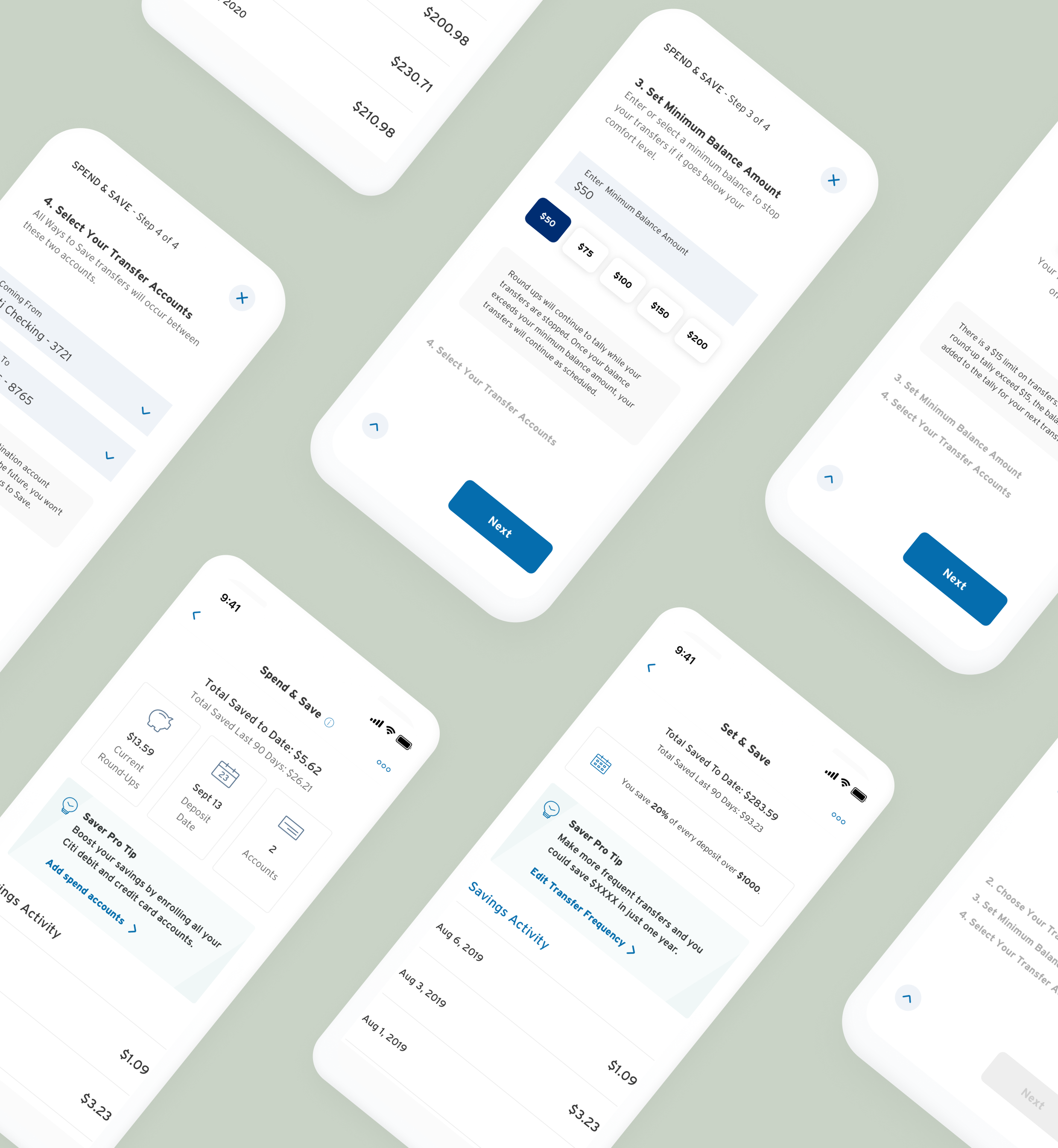
Playbooks are important for design members that want a deep dive on a certain aspect of CDS - examples include mobile tile and atomic design playbooks.
Finally, the community library is an open forum where teams can upload components consisting of CDS atoms used in a new way, entire flows for inspiration, and anything else they believe can be used elsewhere or improved upon.
Above: Examples from our atomic design and mobile tile playbooks.
Metrics
The design system was a huge project that reached so many teams worldwide. Now hundreds of designers and developers across Citi utilize it daily. Here’s how success was measured:
Based on timesheet data design pods are quicker to roll out projects
Less time spent of ensuring accuracy and consistency (and increased brand trust)
Scripts were built with Anaconda to track usage
Metric of at least 5 teams using a component in the community library before it graduated to CDS
Lessons
Buy in from many stakeholders: so many humans brought this project to life and it couldn’t have been done without early support and adoption.
Develop your components from the start, beginning with naming: it’s so important to keep naming conventions & tokens identical across design and development.
Tracking progress: I developed a progress tracker on the same website as the documentation. This way teams could see what was currently worked on and what was coming down the pipeline. They could also make requests for components if there was a need that wasn’t being addressed any time soon.
Constant iteration, testing, collaboration: CDS will continue to grow and improve as more people use it and share their ideas. Treating it as its own product with data driven decisions made the system much stronger at the core.
CDS has come so far since humble beginnings and it’s so exciting to see new features and flows in production using the design system. It’s ever evolving and it will be great to see where it goes in the future.
